Shigeru Miyamoto
Identity System
The designer and creator of Mario, Donkey Kong, The Legend of Zelda, Pikmin, Star Fox, Wii Fit, Nintendogs, and integral in the creation of Pokémon — Shigeru Miyamoto is a living legend in the gaming world.
So what does it look like when you retell the story of a design hero who defined entire genres and generations?
Time:
12 weeks
Role:
Sole Designer
Tools:
Ai,
Id,
Ps,
Ae,
Pr,
Figma
Poster
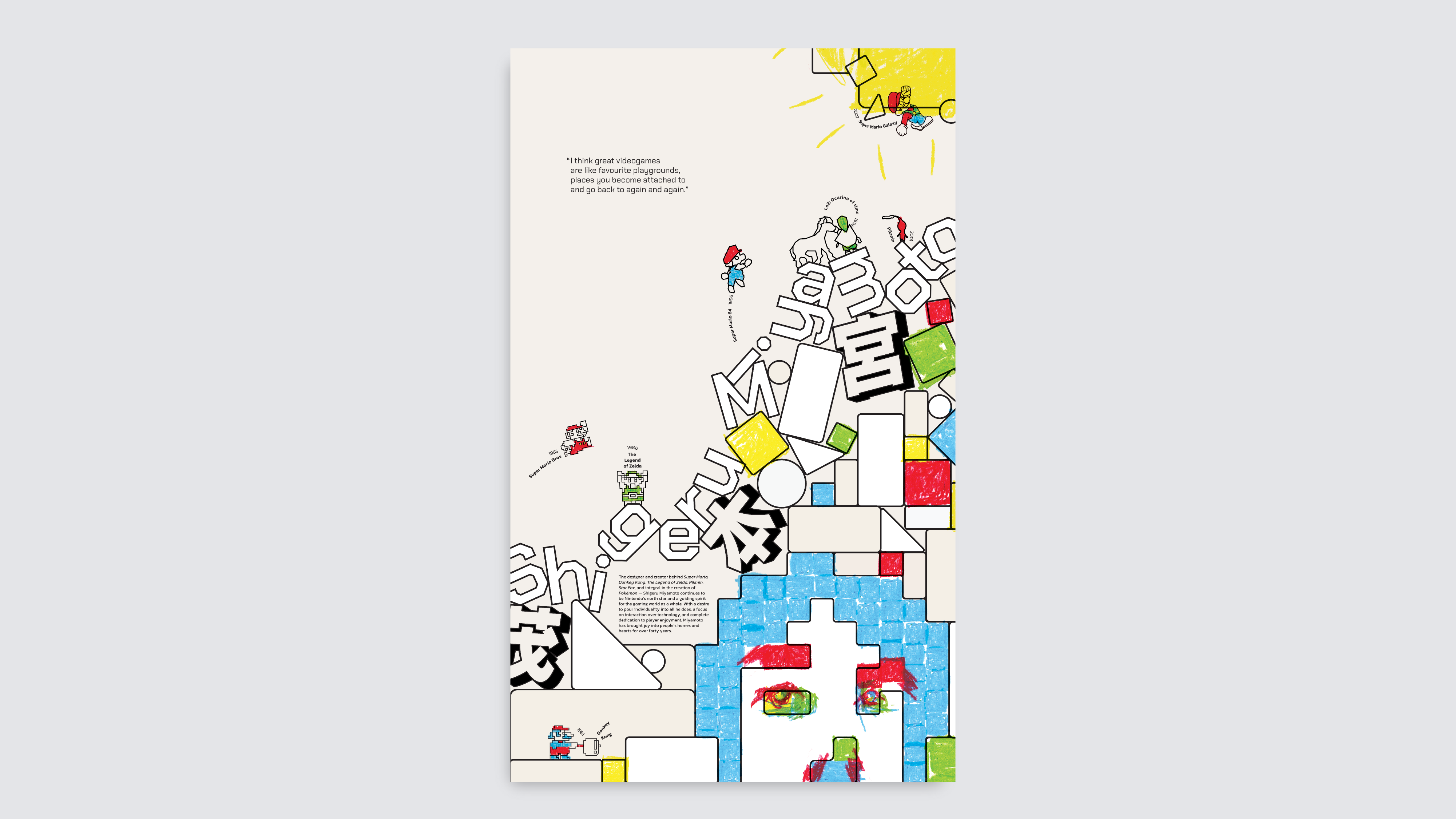
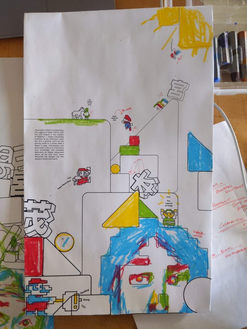
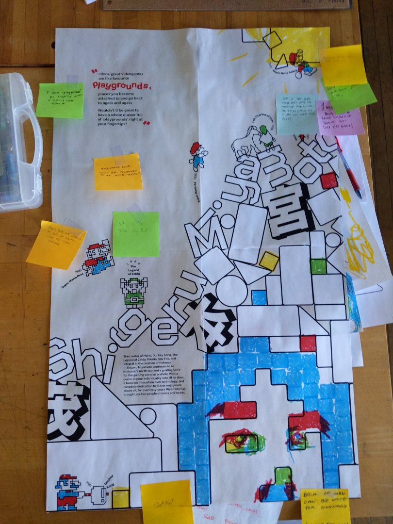
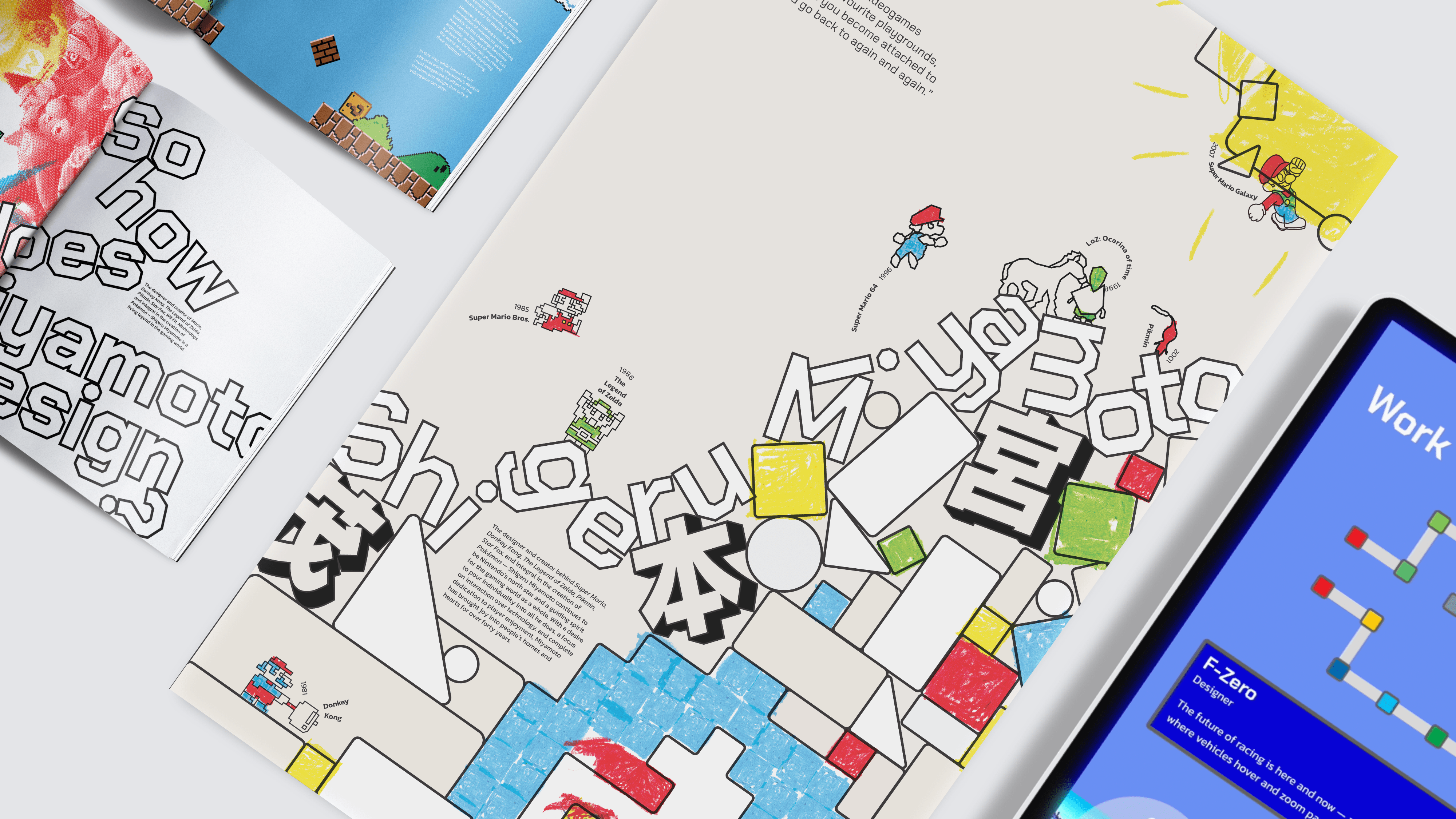
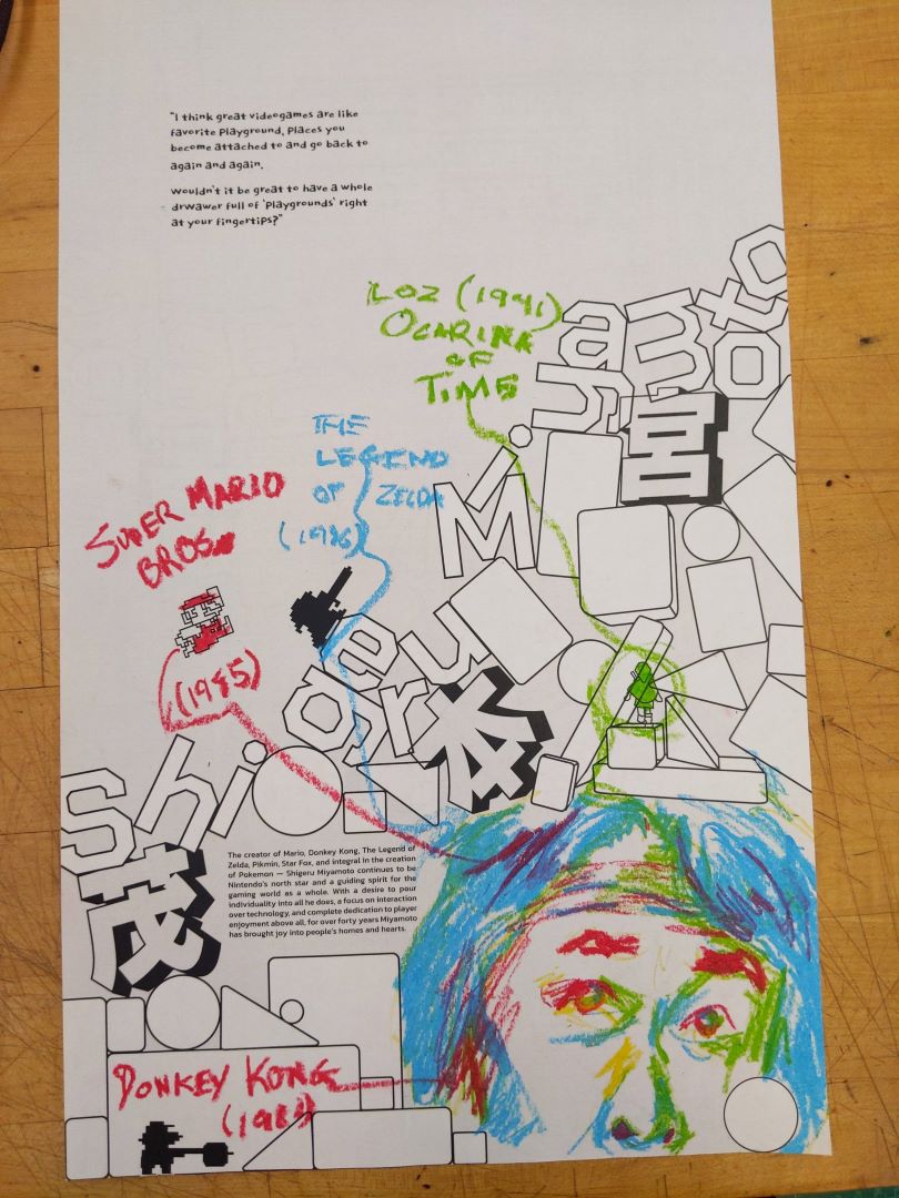
The poster acted as a simple introduction to our design hero. With this in mind, I focused on communicating Miyamoto's commitment to child-like wonder and fun. The shapes, colors, and textures I used, all help to construct a digital yet analog playground where childhoods take place.
I knew from the beginning that I wanted to incorporate physical texture, especially crayons, as a form of implicitly connecting Miyamoto's games to the real world. However, it took me a while to settle on the "crayon-pixel" style which I eventually found.
Booklet
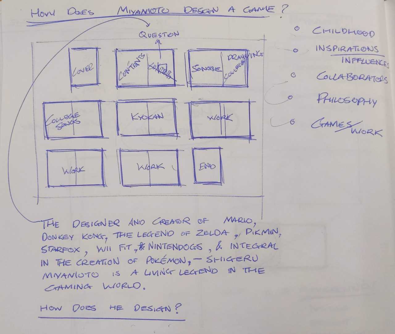
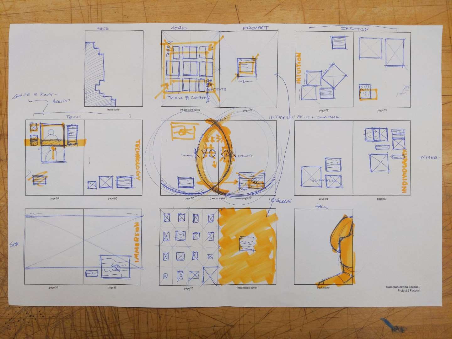
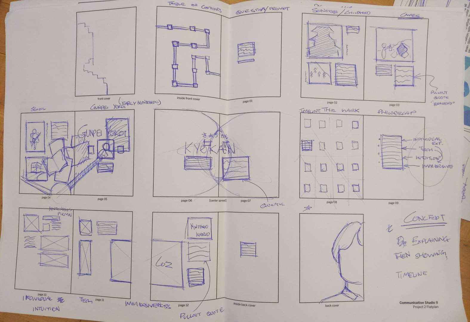
The booklet allowed me to take viewers deeper into Shigeru Miyamoto’s philosophies of design, which I separated into a few key chapters: Intuition, Immersion, Technology, and 共 感 (Kyokan). My brief collection of typographic norms, along with my bright color palette, became the consistent language that made the publication fun and wild, yet cohesive.
At first I wanted to immediately inform the reader of Miyamoto's backstory, and then dive into his philosophies and work later. However, eventually I came to realise that ultimately Shigeru Miyamoto is known for his games.
The characters and worlds which he brought to life are what people have come to expect and want to see, so I should leverage that interest and dive straight into his work, before pivoting towards the experiences and people that inspire him to do what he does.
Kiosk
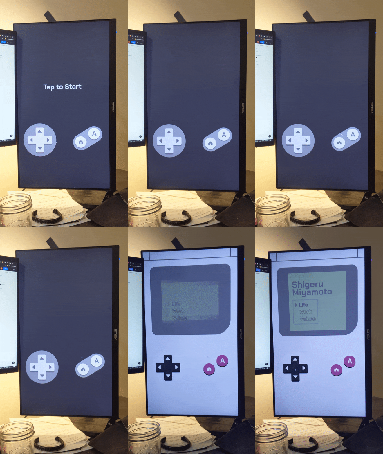
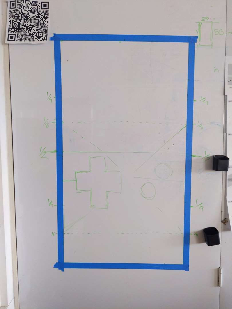
For the interactive experience, I imagined my kiosk living within Super Nintendo World at Universal Studios. With this in mind, I challenged myself to make something that appealed to gamers of all ages. I took care to build the interaction around a nostalgic set of buttons - an interface that playfully challenges our modern intuition to tap directly on a screen's subject matter.
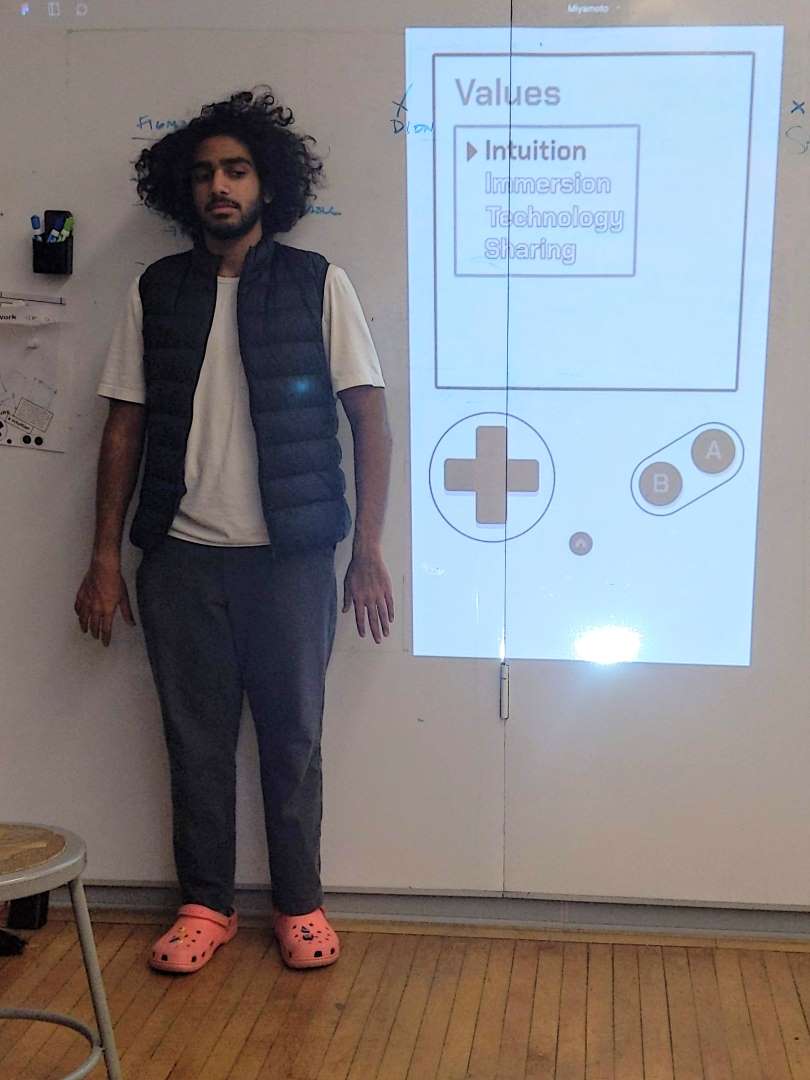
I had a lot of fun prototypying at full-scale, first simply with tape and whiteboard markers, but later with projections. It gave me a lot of confidence knowing how someone would physically interact with my digital prototype, whether they were my height or not.
Motion
The animation allowed me to return to a more condensed format of communication. I really wanted to highlight the dynamic nature of movement and momentum in Miyamoto's work, and drawing from his process I found that a hand-drawn style would be best at telling his story.
Project Reflection
For me, this whole marathon was an incredible dive into the versatility of design. It was tremendously challenging and there are still some areas, like the UI of my kiosk, or certain close-up scenes in my animation, which could be improved. Nevertheless, I am incredibly proud of my work, and the way in which it captured the essence of my design hero, Shigeru Miyamoto.