Program Comparison
BestSummerPrograms Case Study
Role
Product Designer
Duration
Nov 2025—Jan 2026
Skills
End-to-end product design
Interaction Design
Visual Design
Desktop
Mobile
Collaborators
Ethan Huang
Saul Lelchuk
Maisea Bailey
Building a comparison experience that helps students and families evaluate programs and decide what’s worth their time.
❶ Background
Product Context
Helping families navigate summer education options
BestSummerPrograms centralizes information about high school summer programs to help students and families navigate their complexity and cost.
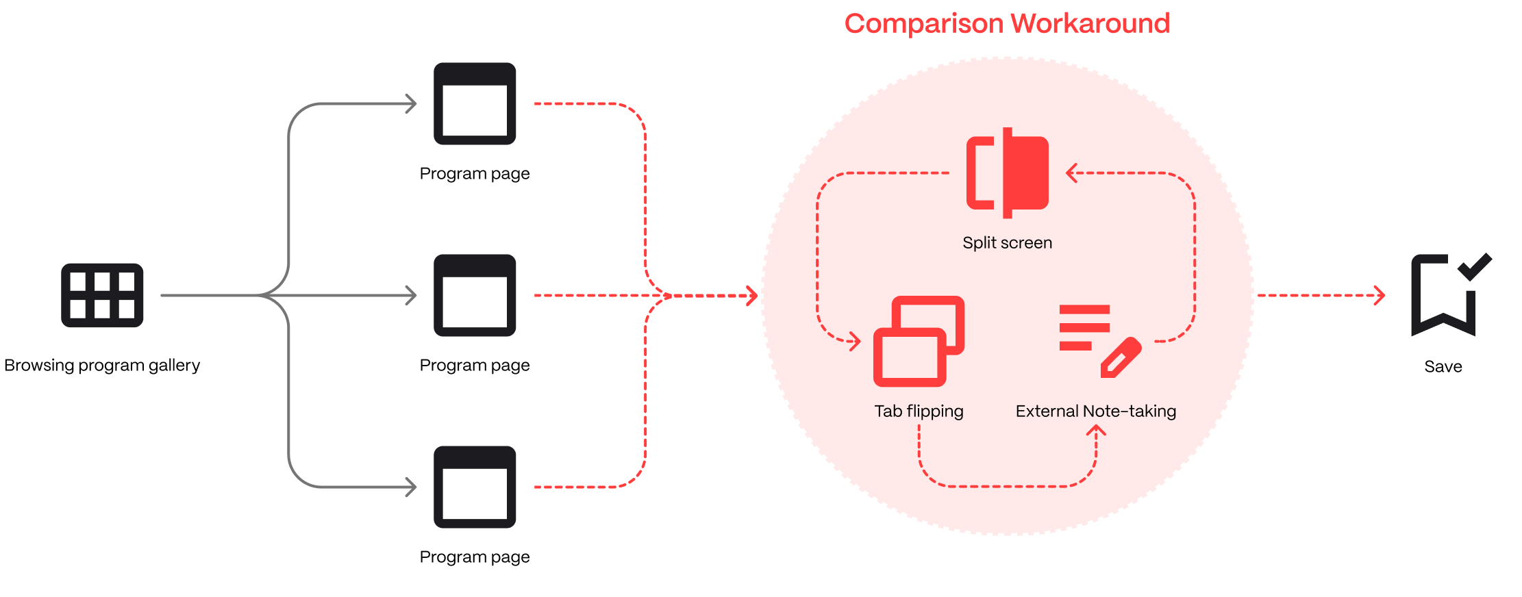
Problem
Users couldn’t easily compare programs
Comparing program details like cost and location is an essential part of making informed application decisions, but without a native comparison feature, users had to juggle tabs or take notes externally for context.
Goal
Make it easier to compare programs while browsing
Our focus was to support program comparison within the platform, so users can quickly put program info in context while they browse and decide which ones to save.
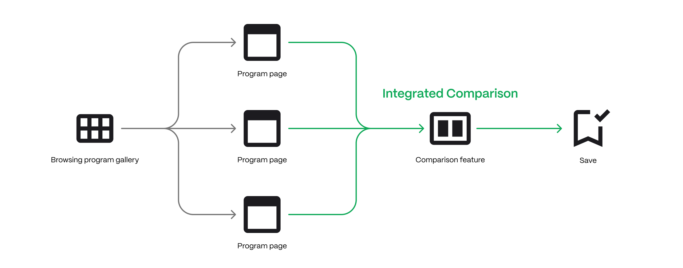
Solution
A reusable, site-wide comparison system
Users can select programs for comparison from multiple entry points, adding them to a persistent taskbar as they browse. When ready, they can compare selected programs side by side.
Select
Review
Compare
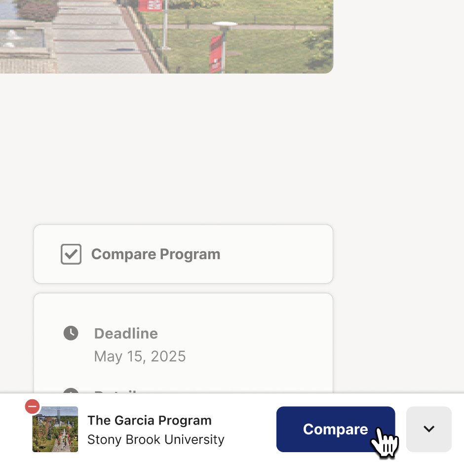
Compare from program pages
For deeper evaluation as you learn
Compare from the gallery
For fast, high-level browsing
Adapted for mobile
Increased information density for compact screens
❷ Desktop Experience
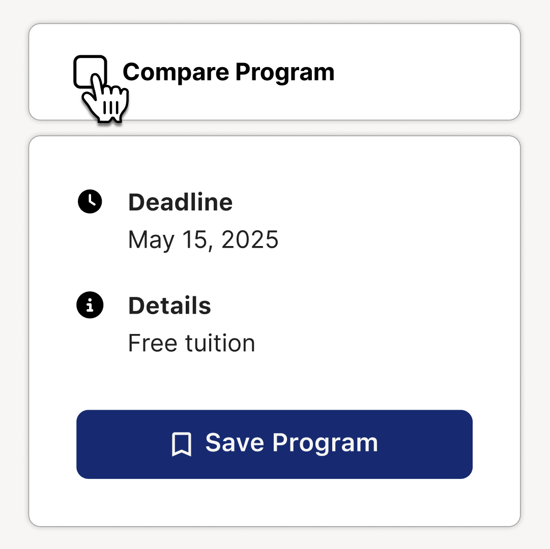
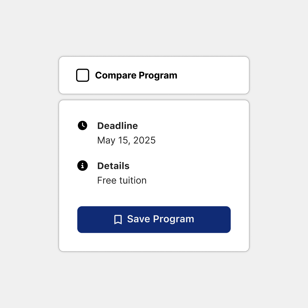
Checkbox Entry Point
Click Compare Program to get started
The Compare checkbox surfaces on program pages, as well as while hovering program tiles in the gallery to reduce friction and empower informed users.
Entry point on program page action panel
Entry point surfaced on program tile hover
Reducing entrypoint prominence
Rather than convey multiple datapoints, the entrypoint just indicates checked vs. unchecked states for scalability.
Initial
Refined
Compare Taskbar
Keeping selected programs in view as you browse
The taskbar provides persistent visual feedback for selected programs, helping users stay oriented as they browse and add find more programs to compare.
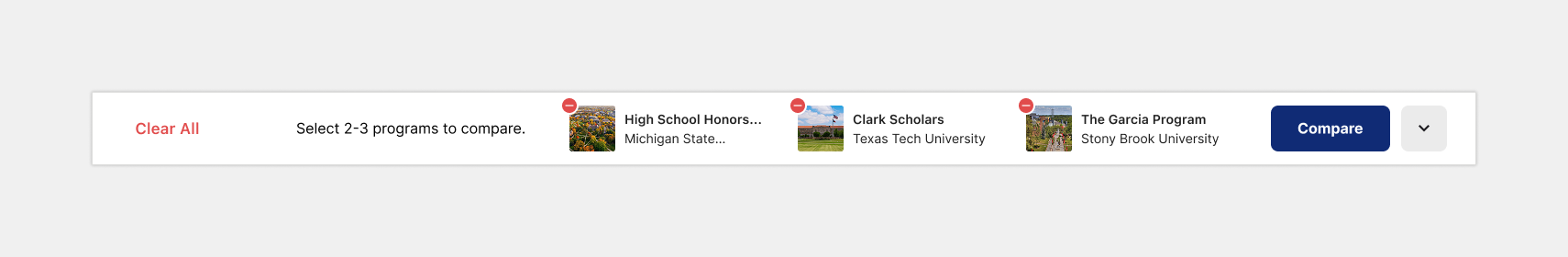
Collapsible, yet still informative and interactive
When collapsed, the taskbar shrinks to a minimal strip, still reflecting selected programs and providing the ability to expand it to see more details.
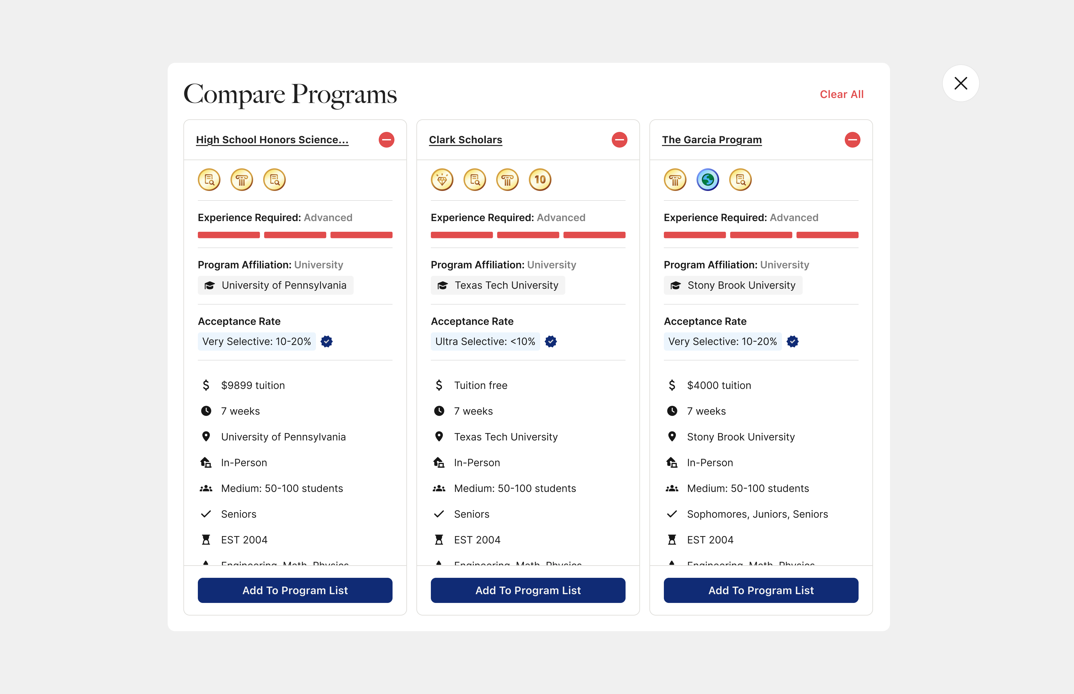
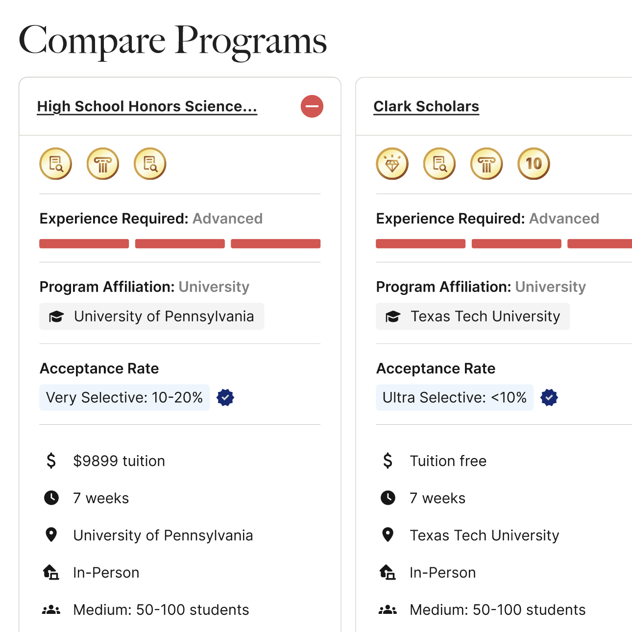
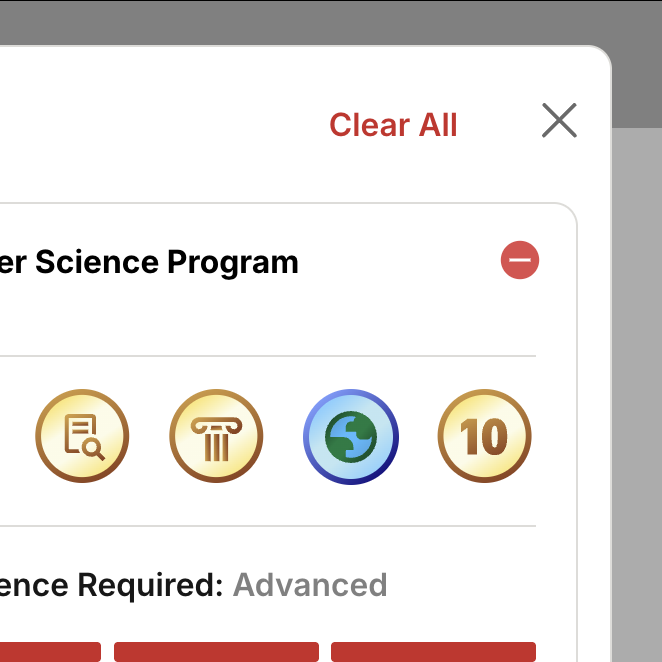
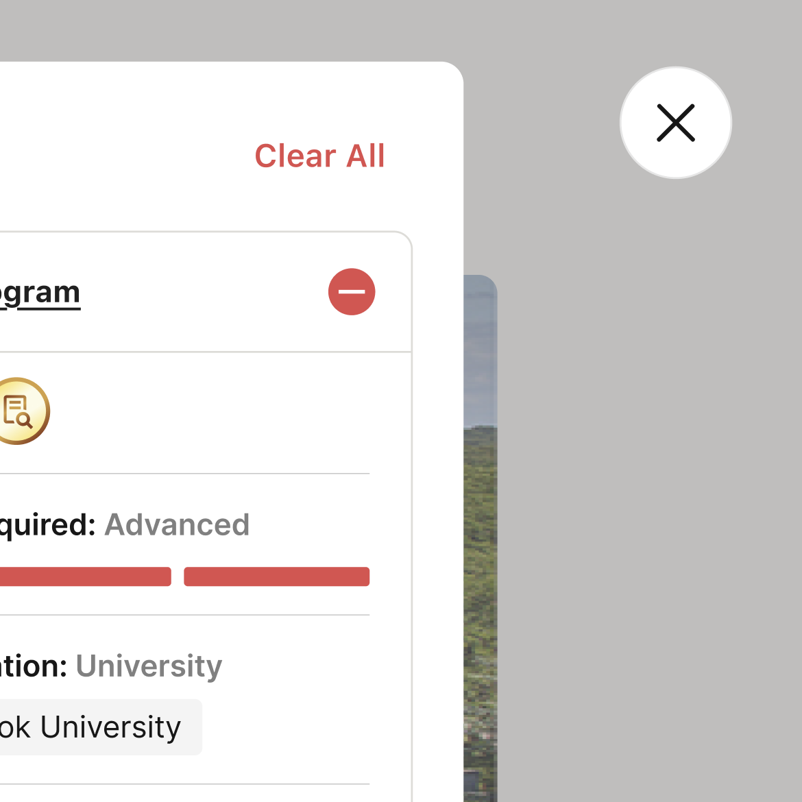
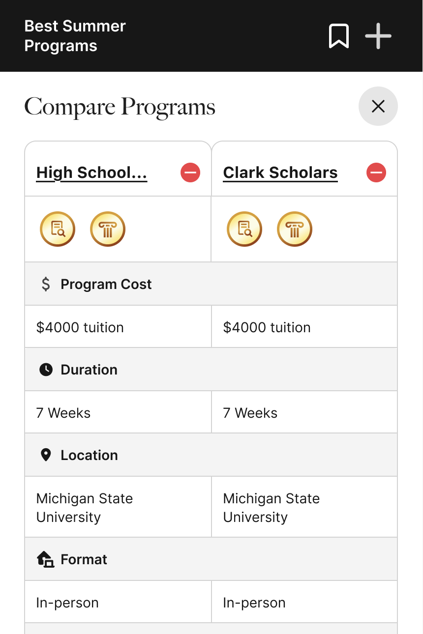
Compare Modal
See program details side by side
The compare modal lays out each program’s core information—badges, affiliation, selectivity, cost, location, and more—so users can compare them in detail and decide which programs to pursue.
Informative, and action oriented
Users have the flexibility to add programs to their saved list, or edit their comparison selections. The purpose is to keep the modal fluid and reusable.
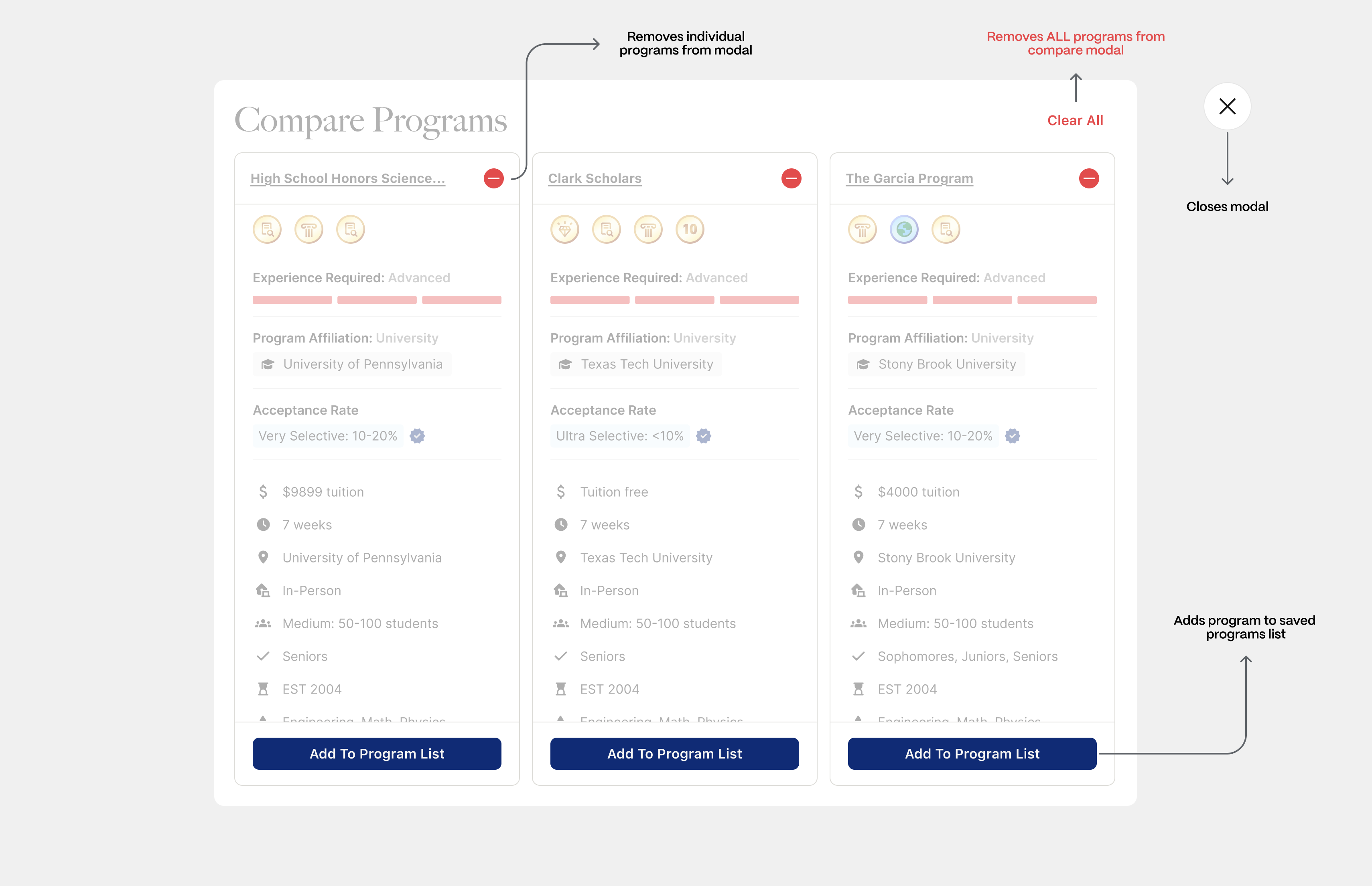
Distancing destructive actions
Clear and close actions vary significantly in their severity, and were separated to reduce cognitive load and accidental actions.
Initial
Refined
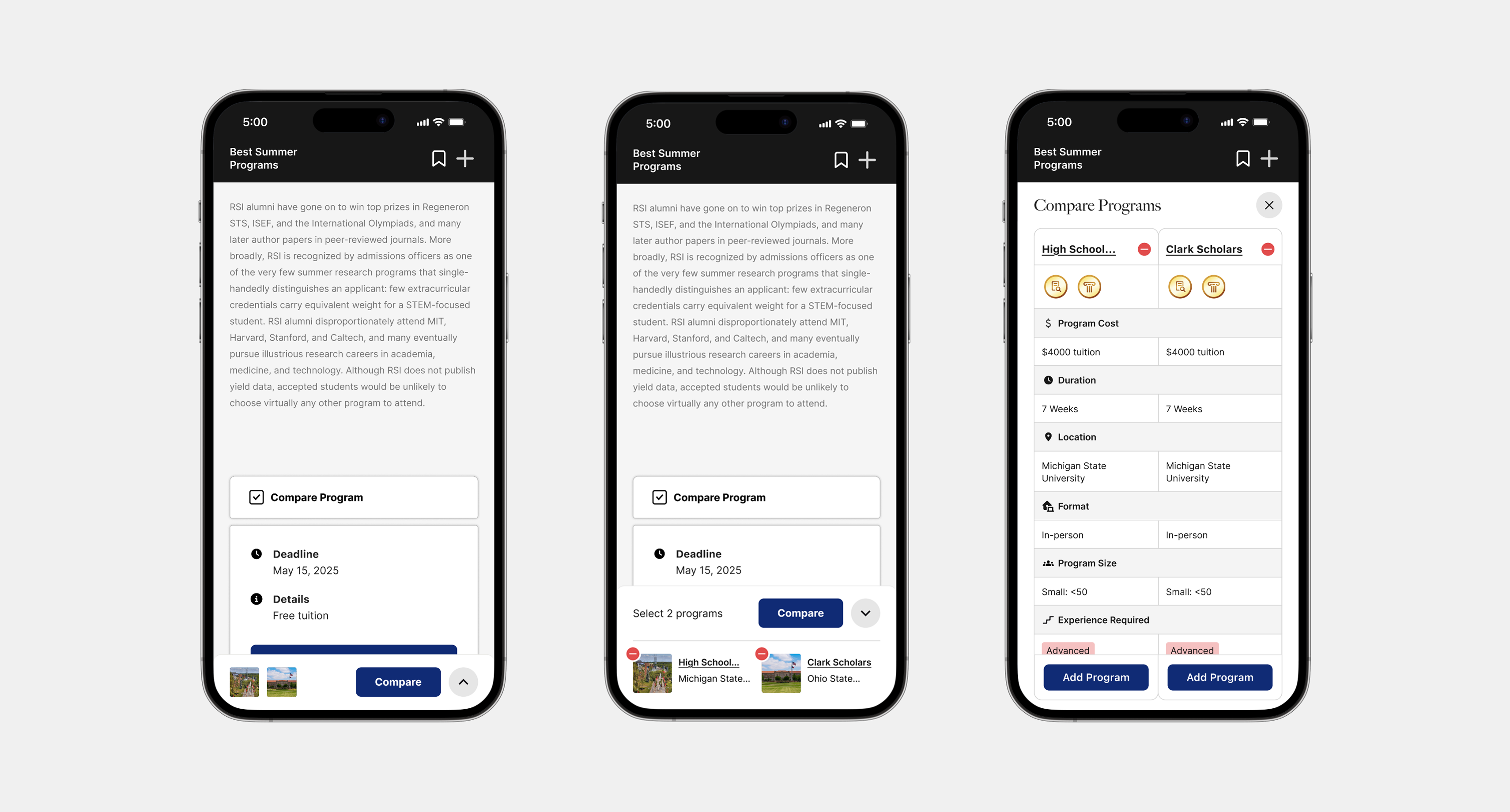
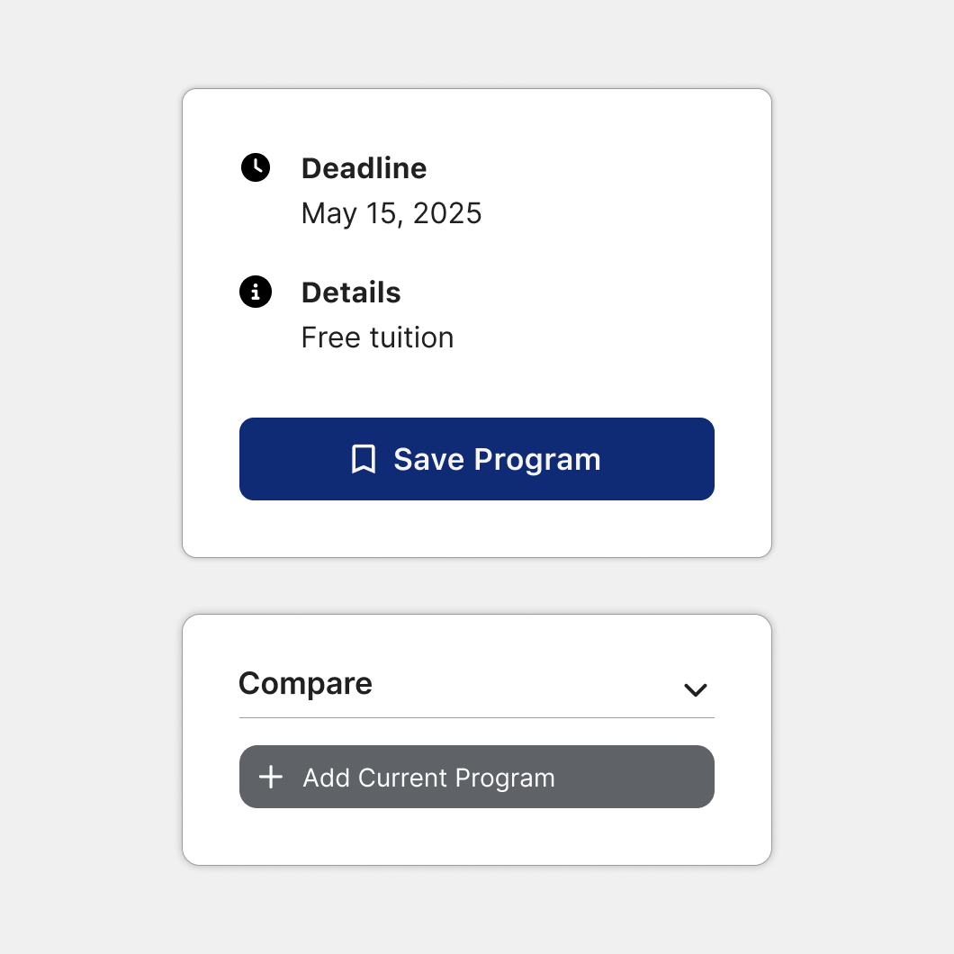
❸ Mobile Experience
Overview
The same experience but more compact
To maintain structural consistency with desktop while respecting mobile constraints, the comparison cap was reduced from three programs to two.
Priotizing left-to-right scannability
A denser two-column layout was chosen over a minimal, stacked variant to maintain lateral scannability and keep patterns consistent across platforms.
Initial

Refined
❸ Results
Takeaway
Building with flexibility for different workflows
Because users compare at different moments in their decision process, we focused on building a flexible system rather than isolated comparison screens.
Next Steps
Incorporating more interaction feedback
With flexibility in mind, we want to continue exploring selection and notification patterns and feedback on the gallery, program page, and program list surfaces that make comparing feel intuitive across the platform.