Atlas
Role
Sole Designer
Sole Developer
Duration
Jan—May 2025
Skills
Interaction Design
Data Visualization
Prototyping
Vibe Coding :^)
Tools
Figma
JavaScript (d3.js)
HTML/CSS
Python
OpenAI Whisper
CLIP, BLIP, OCR
A web platform that visualizes our short-form media diets, and prompts reflection on our consumption.
❶ Background
Problem
Social media algorithms are opaque
It’s hard to grasp just how narrow our digital view can be or how much it may diverge from the experiences of others.

Solution
Atlas puts your social media diet in context with others
Using user-submitted content, it maps our tastes, similarities, differences, and blindspots, all in one shared view.
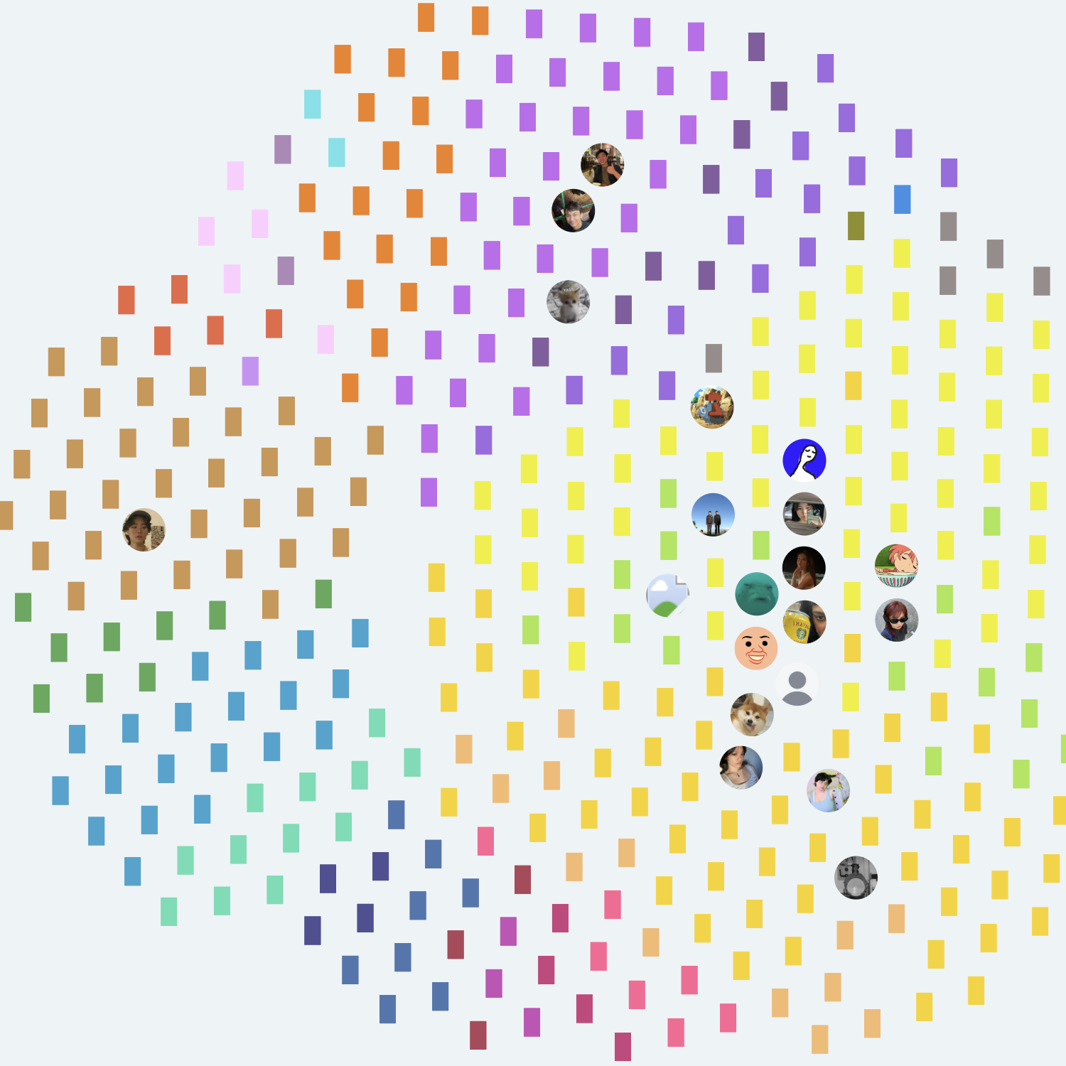
Each colorful node is an Instagram Reel / TikTok that's been submitted to Atlas.
Ideal User Flow
Ideally, users could link their social media accounts directly to Atlas to get a complete view of their habits and tastes.
Actual User Flow
Because large-scale data transparency isn’t feasible, Atlas relies on voluntarily submitted user content.
❷ Core Experiences
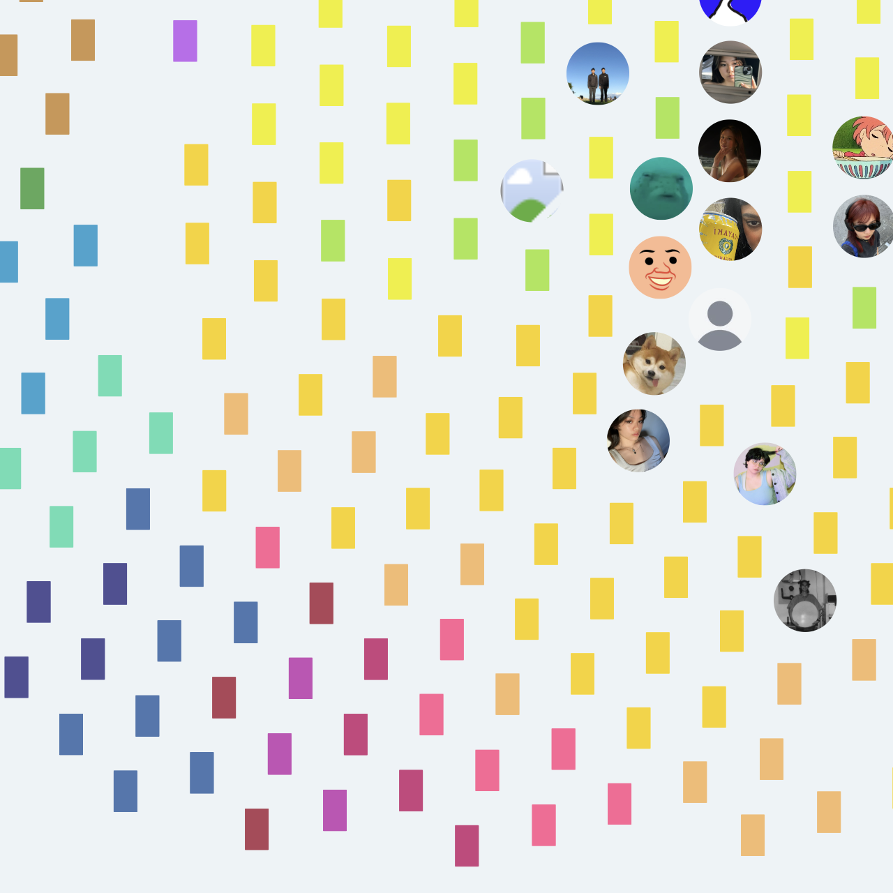
The map
Color coded content map
With 400 video submitted by 20 unique users, I used ML tools—Whisper, CLIP, BLIP, and OCR—to categorize and color-code each one, forming distinct genre regions.
Choosing abstraction over detail for visual clarity
Early thumbnail previews were replaced by opaque genre colors to reduce information overload at scale.
Before
Thumbnails communicate well individually, but create visual clutter in aggregate.
After
Video previews are hidden behind opaque genre colors - sustainable at scale.
Prioritizing organic structure over rigidity to fit a fluid content ecosystem
Early maps were overly rigid, and didn't reflect the chaotic short-form media environment. The final map is more organic, only introducing legible structure through user interaction.
Before
A rigid ring, while legible, feels at odds with the realities of the content ecosystem.
After
The final map is chaotic, but creates space for legibility through interaction.
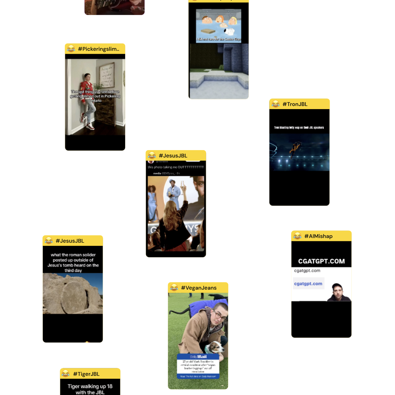
Hover for quick info and links
Hashtags and video previews offer quick, hyper-specific context on hover, while link lines reveal how content and users connect in a broadened collective algorithm.
User Hover
Hovering on a user highlights all the videos they’ve submitted.
Video Hover
Hovering a video plays a preview, provides a descriptive hashtag, and links to the submitter(s).
Card overlays
Click for info-rich cards
Purely spatial layouts can make patterns visible, but leave details unclear. Cards complement the map by presenting structured data in a more familiar format.
User Click
Clicking a user clusters their videos, and creates a user analysis card.
Video Click
Clicking a video creates a video player card and tethers the node to it's submitter until unselected.
Multi-select users to compare and contrast
Users aren’t limited to one perspective. By selecting multiple users at once, they can trace where their algorithms overlap and diverge.
These users not only share tastes but also submitted content, creating direct links.
Cards as navigational tools
The map and cards were designed to work in tandem. Each interaction within a card re-engages the map, creating a loop between detail and discovery.
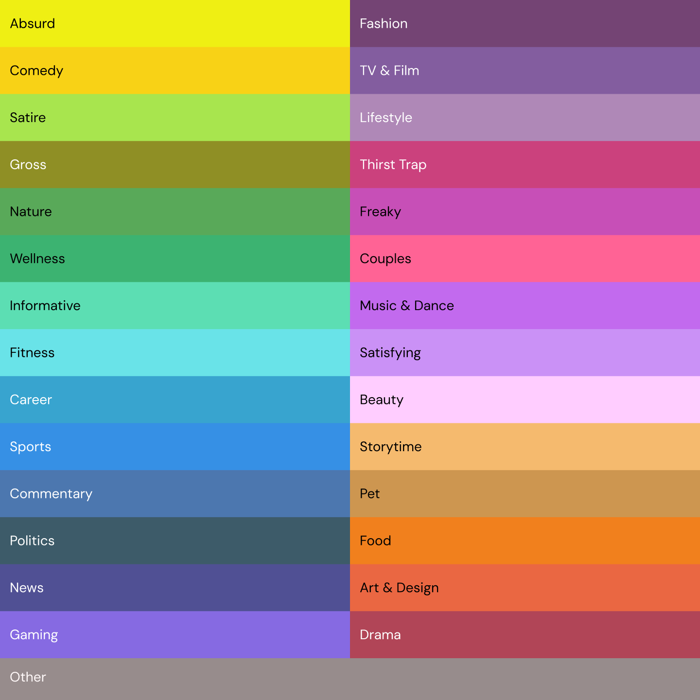
Genre Breakdown
Hovering over genres on the user card lights them up on the map.
User Suggestion
Selecting suggested users on your card activates their content cluster on the map.
Surfacing unseen mutuals and genres
Atlas maps what users see and points to what’s missing. By highlighting overlooked genres and distant voices, it nudges towards a fuller view of the algorithmic world.
Suggesting your opposite
Atlas suggests an opposite for each user: someone with very different tastes.
Unexplored Genres
An interactive list of unexplored genres for each user
❸ Results
Takeaway
Prototyping with code is sick :^)
Because of Atlas' niche context and goal, I couldn't rely just on creative software to design my map. I needed to actually code to find the interactions and visual feedback that felt most natural.
Next Steps
Building a more robust onboarding and takeaway
The most common feedback I've received about Atlas is that it's a bit daunting and could use a friendly onboarding. In tandem, it will be great to work on what things users can tangibly takeaway from the experience, like potentially a receipt of their algorithmic profile, or shareable png's.